The contents of this page may only be used for hiring evaluation. DO not share.
The way I work
My day-to-day toolkit is a fairly standard one for product and user experience professionals. I rely on activities that allow for divergent and convergent thinking (double-diamond), an assumption matrix, a decision log, prototyping, and a mechanism to measure results.
How these get used will vary from need to need, so I will give some real examples of problems or mandates I have been given and that various approaches I have taken to get results. As of this initial revision of this page (March 2026), I am including my most and least recent examples. I am planning to add several more over the next couple weeks.
I am happy to talk about design and process ad nauseum, so please reach out if you would like to discuss further.
A Flexible and Reusable Process
This is a genericized version of a slide I often use to communicate the design process with leadership, and to reinforce process within my teams. See the case study below from my time at Cox Automotive (2020-2025) for an example of how I applied this process.
Process
From problem discovery to measured outcomes
A disciplined but adaptable approach — anchored in research, aligned with the business, and validated with real users.
Discover
Ethnographic research · Stakeholder interviews · Analytics review · Assumption matrix
Define
User mapping · Jobs-to-be-Done · Prioritization · Business alignment
Design
Interaction design · Prototyping · Design standards · Team critique
Validate
Usability testing · A/B testing · Cross-functional sign-off · Accessibility review
Ship
Developer handoff · QC checklist · Phased rollout · Documentation
Measure
Analytics · NPS / CSAT · Task success rate · Iteration loop
Methods I reach for
Research
Strategy
Design & delivery
Cox Automotive owns some of the biggest products in the automotive sales industry. Consumer-facing brands like Kelly Blue Book and Autotrader, and brands that automotive dealers use to run their entire business from inventory to timekeeping to finance.

Powering the full enterprise platform is my team, Common Core. We developed and maintained our own set of products, which I served as Lead UX Architect:
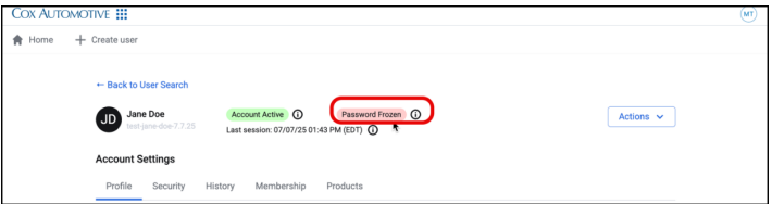
Bridge ID - Users previously had separate accounts/sign-ins for each product. Bridge ID is one account, one sign-in, with robust authentication protocols and self-serve recovery options.
Bridge Administration Tool - This is the support tool for Bridge ID. Originally released internally to Cox Auto customer support, we rolled it out to dealer customers so that they could manage users easily on their own.
Bridge Bar - A unified navigation and information rail that exists across all products. Provides context switching, notifications, and user settings.
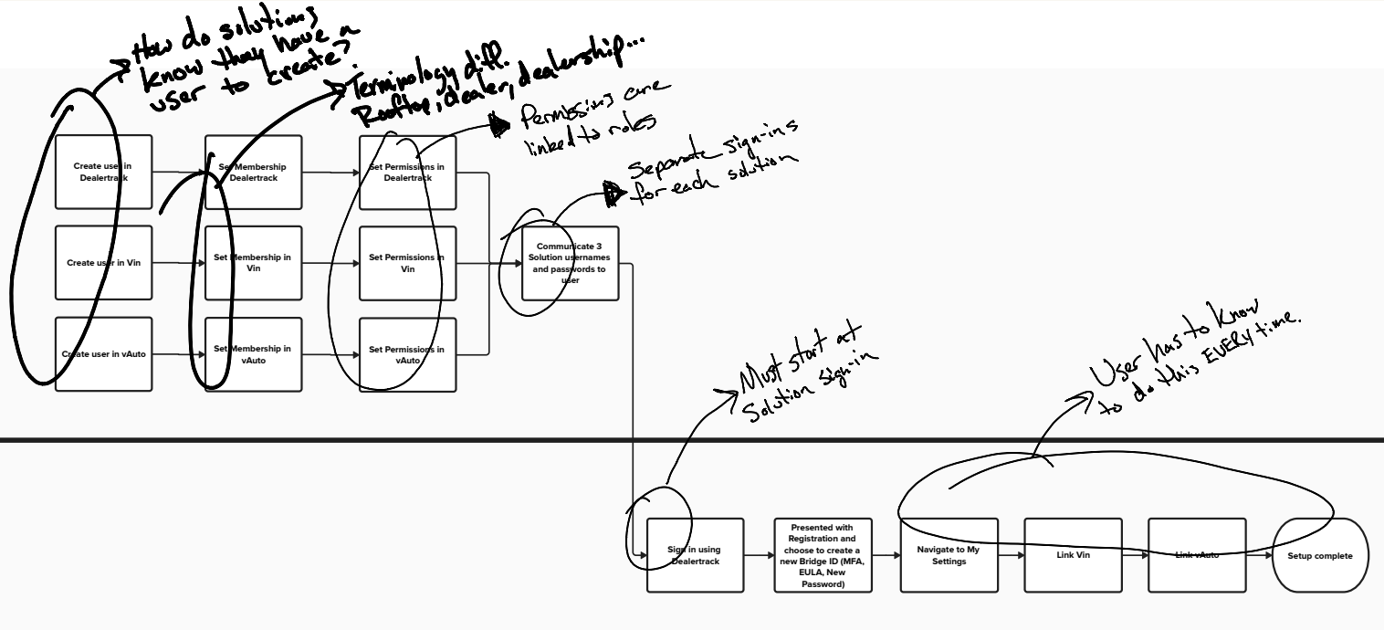
I am going to walk through how we took the internal Bridge Administration Tool and released it as a customer-ready product.
Origin
Since we released the Bridge Admin Tool to Support, time spent on Bridge-related support calls has been reduced by over 40%. What if we gave Dealers the ability to admin their own employees?
Discovery
We began two concurrent research tracks:
What architecture did we as Cox Auto need to consider to make this customer-facing?
What would make this tool desirable to customers?
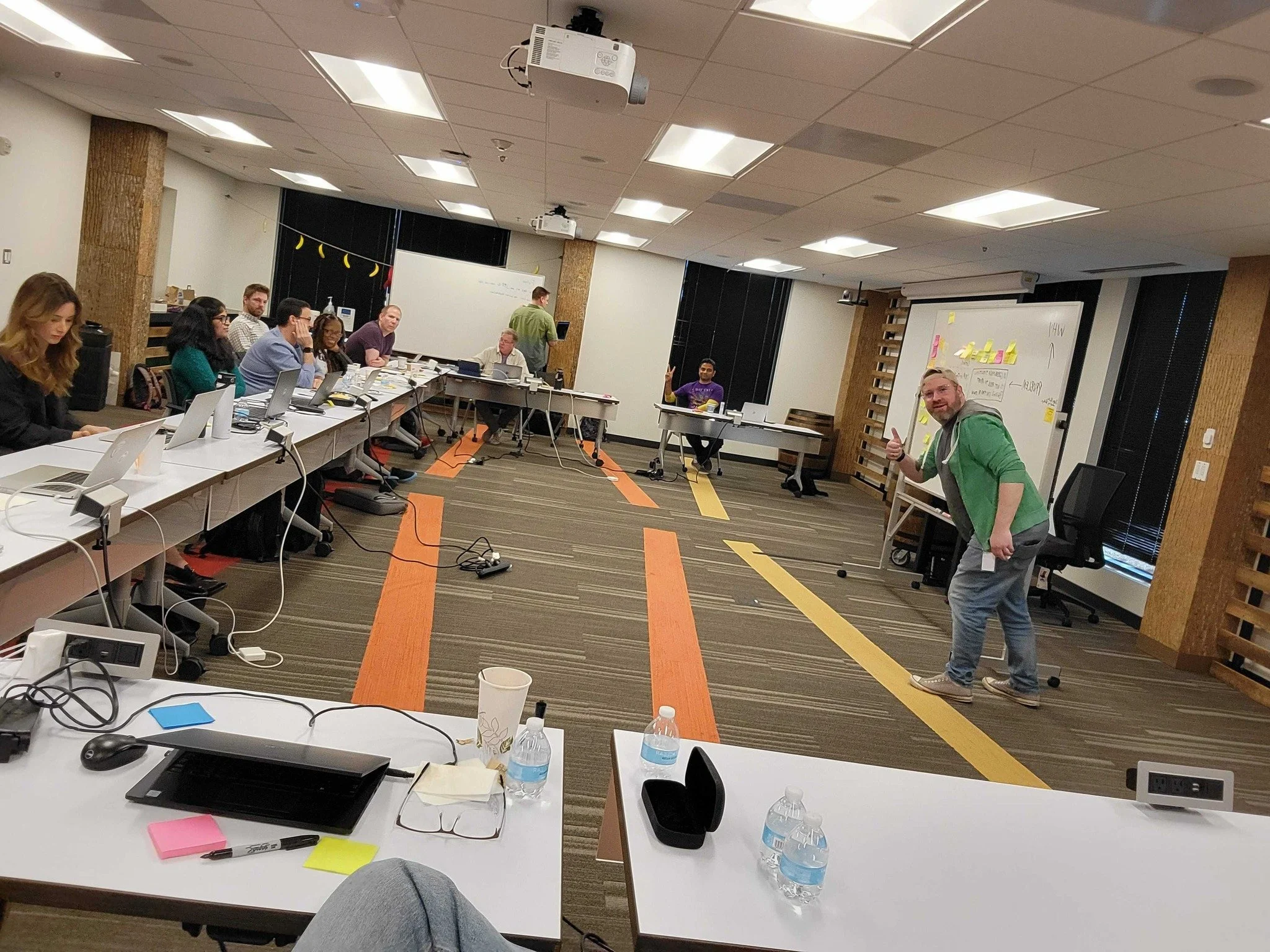
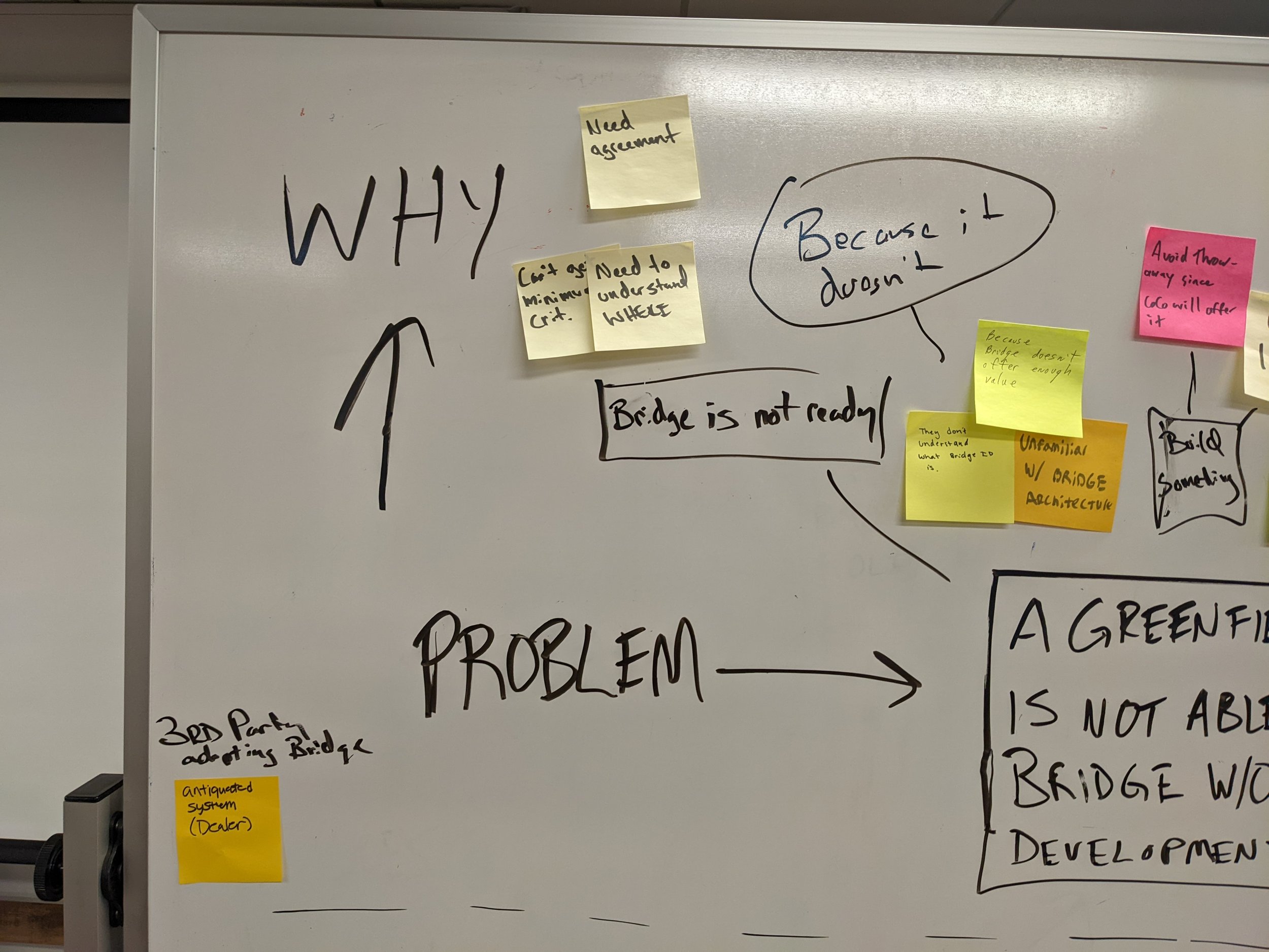
We flew the Product team and representatives from Architecture and Engineering to Austin, TX where I led a 2-day design summit with the goal of articulating the concept for leadership. It also gave cross-functional visibility into the concept and a chance for broader participation and ownership.
Over the two days, we did an abstraction laddering activity to set the levels at which we were going to tackle the project. We also built a stakeholder map and I had teams design and present a vision of what this product might be like to use.
Me and the lead Product Manager for Bridge set up a series of interviews with General Managers, IT Leads, and Department heads at dealers to understand their processes of onboarding, offboarding, and managing employees. It is important to understand the overall process, not just how they interact with our software to get the full picture.
One of our top insights was that auto dealership have very high turnover, including former employees often returning. User management was not “one and done” but a daily activity.
Define & Design
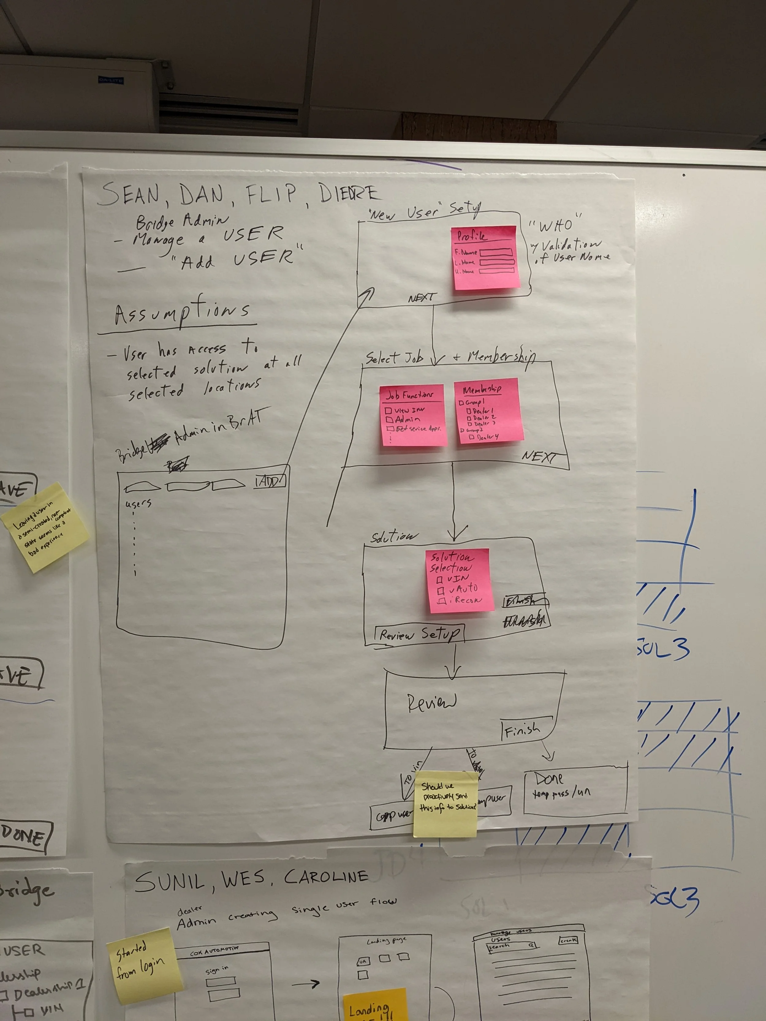
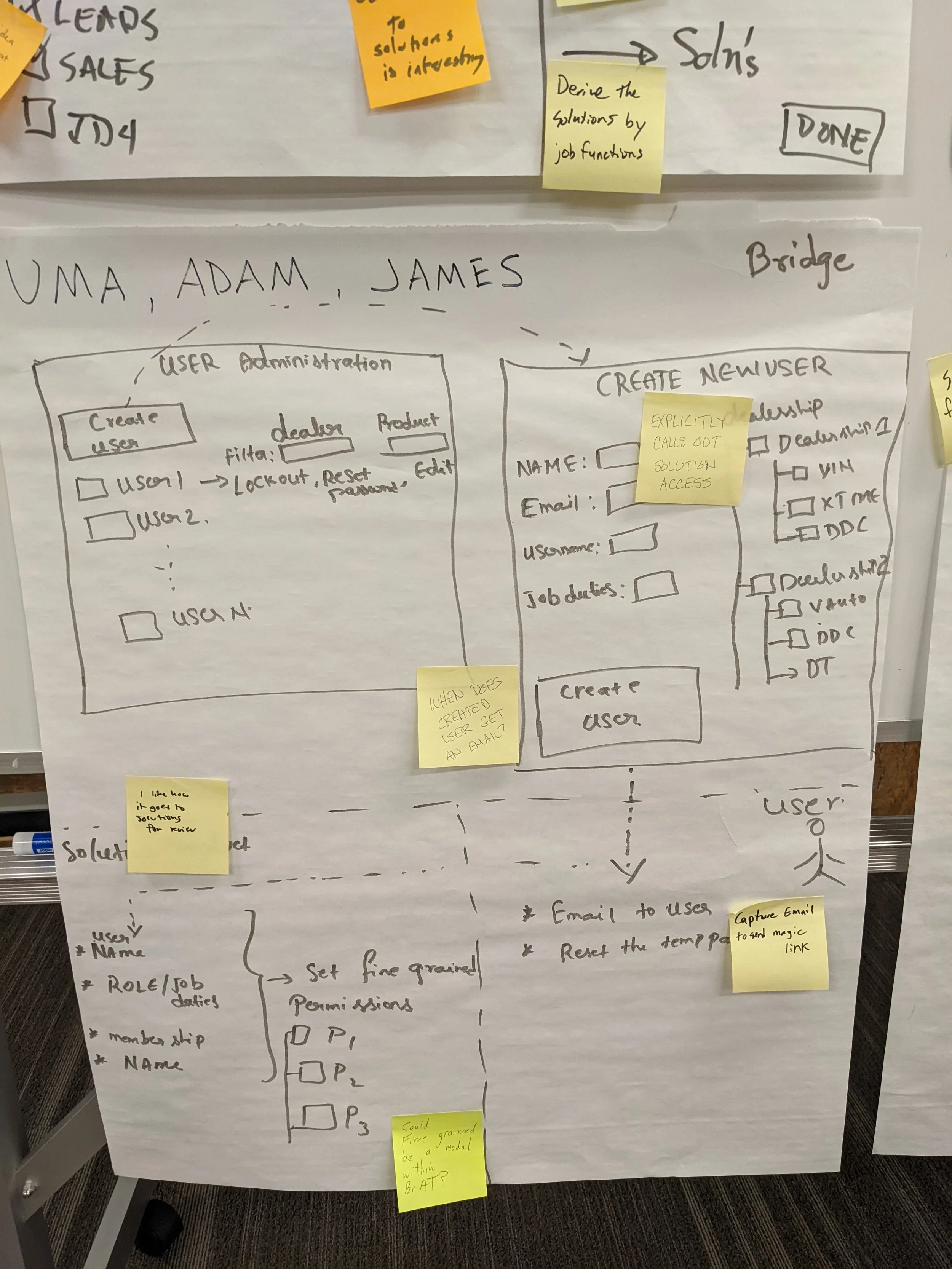
I began working with our team UX Designer and UX professionals in other Product groups to present our proposal, gather feedback, and fill in gaps. Our personas were simple but straightforward. User flows were more complex due to the fact that dealerships take pride in creating their own processes rather than relying on an industry standard.
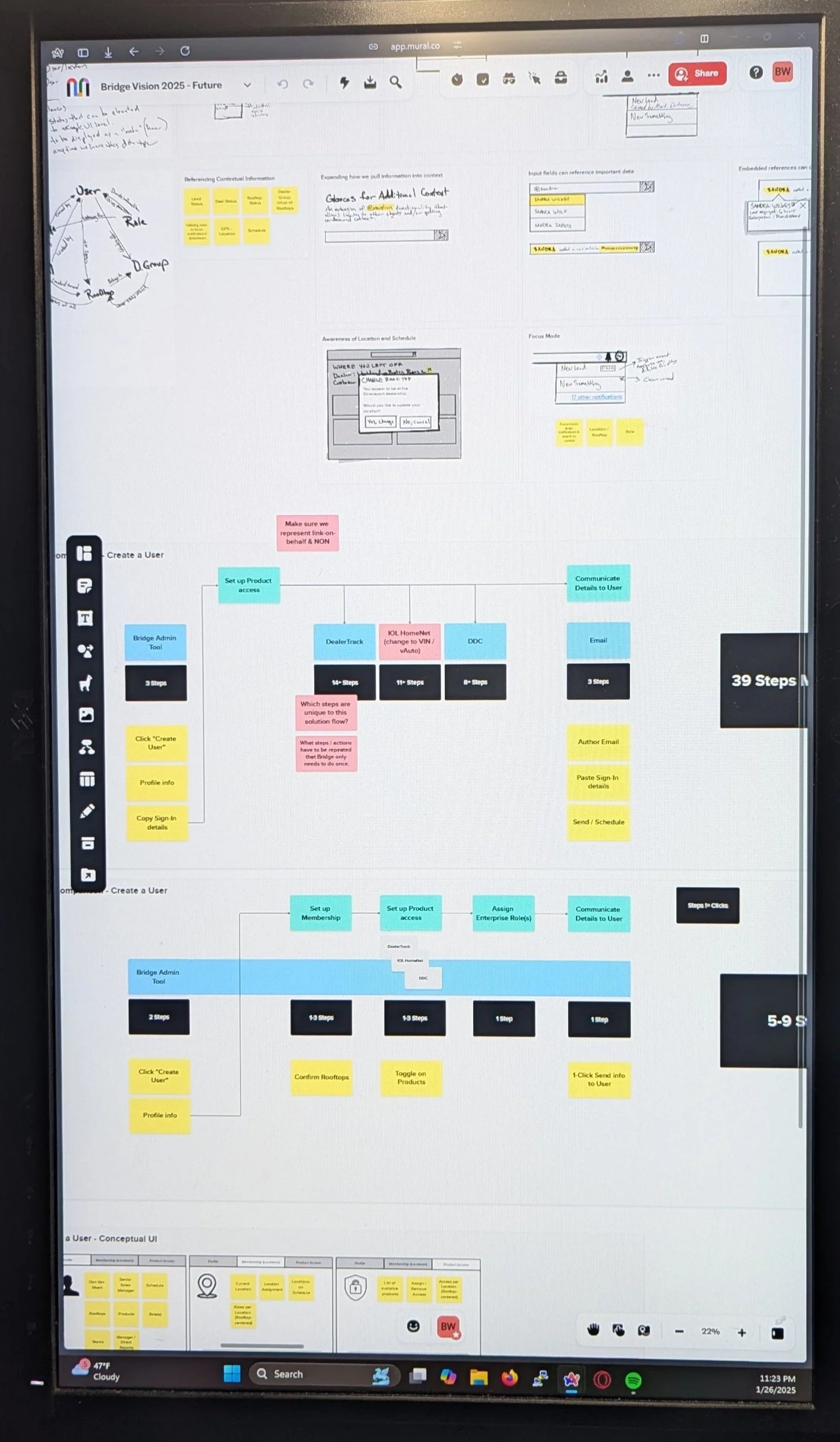
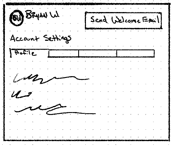
This led to me creating an AI-assisted workflow that saved me considerable time. I wanted a simple way to input data without worrying too much about visual design, as that was time-consuming with all the editing. Mermaid.js creates diagrams from text, so I could structure the user steps and flows in VScode and use a Mermaid addon to display the visualization in the IDE. Because it was all plain text, it was easy to ask any AI (we had ChatGPT and Claude available to us) to manipulate or provide variations of the flows. Keeping everything versioned in Github made it easy to share.
We now had user flows and journeys in a format anyone could see, modify, explore.
Most prototyping for user testing was done in Figma’s classic tools, though we began using Figma Make for even more detailed prototypes in 2025.
Validate & Ship
We returned to our customers with our prototypes, gathered feedback, iterated. The organization had launched a new design system, of which I was a contributor and ambassador, and we reviewed with the governance team for compliance.
I worked with Product Managers to review epics and ensure the experience was being communicated and artifacts were in place. Once Engineering had an MVP, we found customers who were interested in being early adopters and let them begin using the features.
After a couple of months of tweaking and fixing and resilience work, we did our wide release.
Measure
We had long used Google Analytics and we set up our usual tracking events, but we had recently implemented Pendo which gave us a brand new way to explore paths and watch actual sessions.
Several of our top users by activity went from calling Support multiple times a week (password resets, lost MFA factors, offboarding access changes) to zero — they were able to handle all of these tasks themselves, in alignment with their dealer’s processes, quickly.
Pendo also gave us some excellent data about how people chose to find the users they needed to take action on. We had assumed that the dealer location (for dealers that had multiple) would be a key piece of information, but these admins were so intimately familiar with the employees that they were dealing with every day that using their name or MFA factor (mobile usually) was all that was needed 95% of the time.
This was a huge win for our customers and a huge burden taken off our own Support team.
Design Summit to explore the concept with cross-functional representation.
Heuristic evaluation + design changes through the lens of our customers’ top pain points.
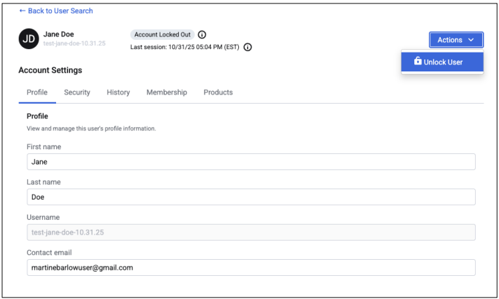
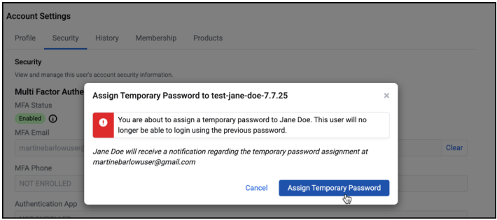
Customers now have the control to create, edit, lock, unlock, and manage access and security of their employees without needing to contact Support.

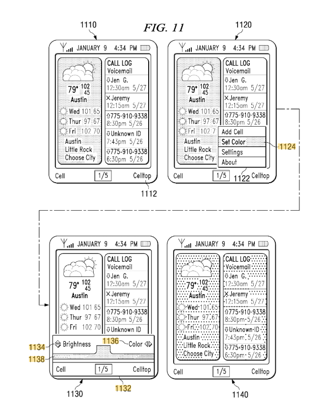
All the way back in 2006, Apple had only just announced the iPhone. Smartphones already existed (Blackberry, HTC, Sidekick) but they were expensive, niche, or for business. Alltel (who wanted to make themselves attractive for buyout) approached frog design with a problem:
“How can we get average users, on our baseline feature phones, to agree to use more data?”
Data was pricey, even the tech savvy only thought about it in terms of WAP (Wireless Application Protocol) browser functionality, which was a terrible experience. Our design team consisted of a visual designer, design analyst, design technologist (me), and a small engineering team in Ukraine.
Our research involved interviewing tech-literate mobile users to understand what they found valuable about the data they were paying for and with inexpensive flip-phone users to understand their current frustrations and what might push them to spend more. We learned:
The tech-literate knew what data they wanted and were willing to work to get it.
The everyday user wanted it to “just work” and not bother with irrelevant junk.
Our design concept, while common today, was unique in the mobile world for the time. Give the user a rich, customizable UI, that starts when the device powers on and never uses data without communicating that intent. After discovery was done, my day-to-day role became working with the visual designer to get an interactive UI operating to our standards on a real device (Moto RAZR v3). We created a set of “widgets” that included weather, recent SMS messages, sports scores from your favorite team, and more.
The design, named “Celltop”, won a CTIA award and was positively reviewed. Alltel was subsequently acquired by Verizon. The iPhone would go on to revolutionize what a customizable, data-driven experience could be but our design was robust enough that we filed a patent for it.

“While Apple's iPhone is slated to cost $500 to $600, Alltel's Celltop technology can be had on a $49 handset.”
- Ad Age
Other Projects
I am always working on something whether it is to learn a technology or explore an idea that I find personally interesting. Below are two recent examples that I have been working on with some AI assistance (Replit, Claude, VSCode integrations).
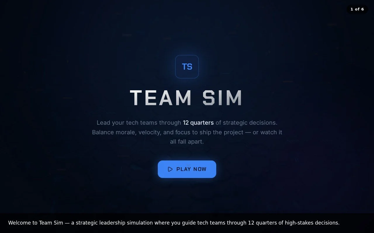
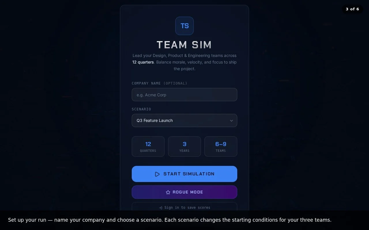
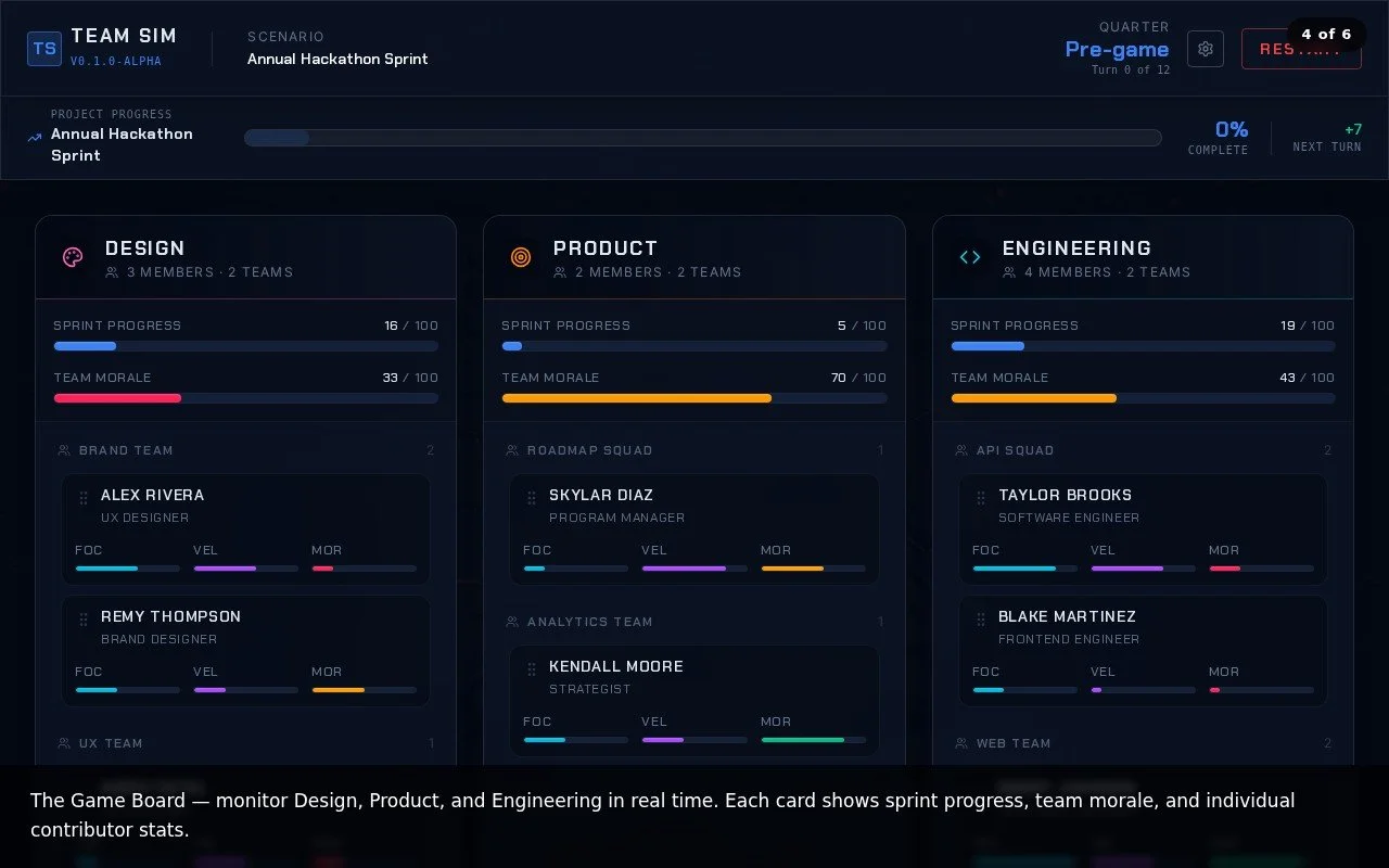
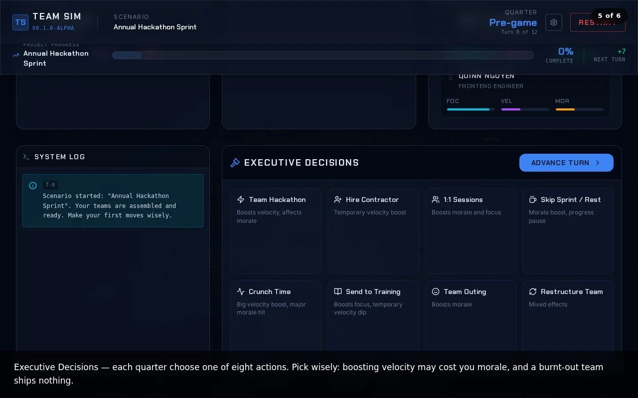
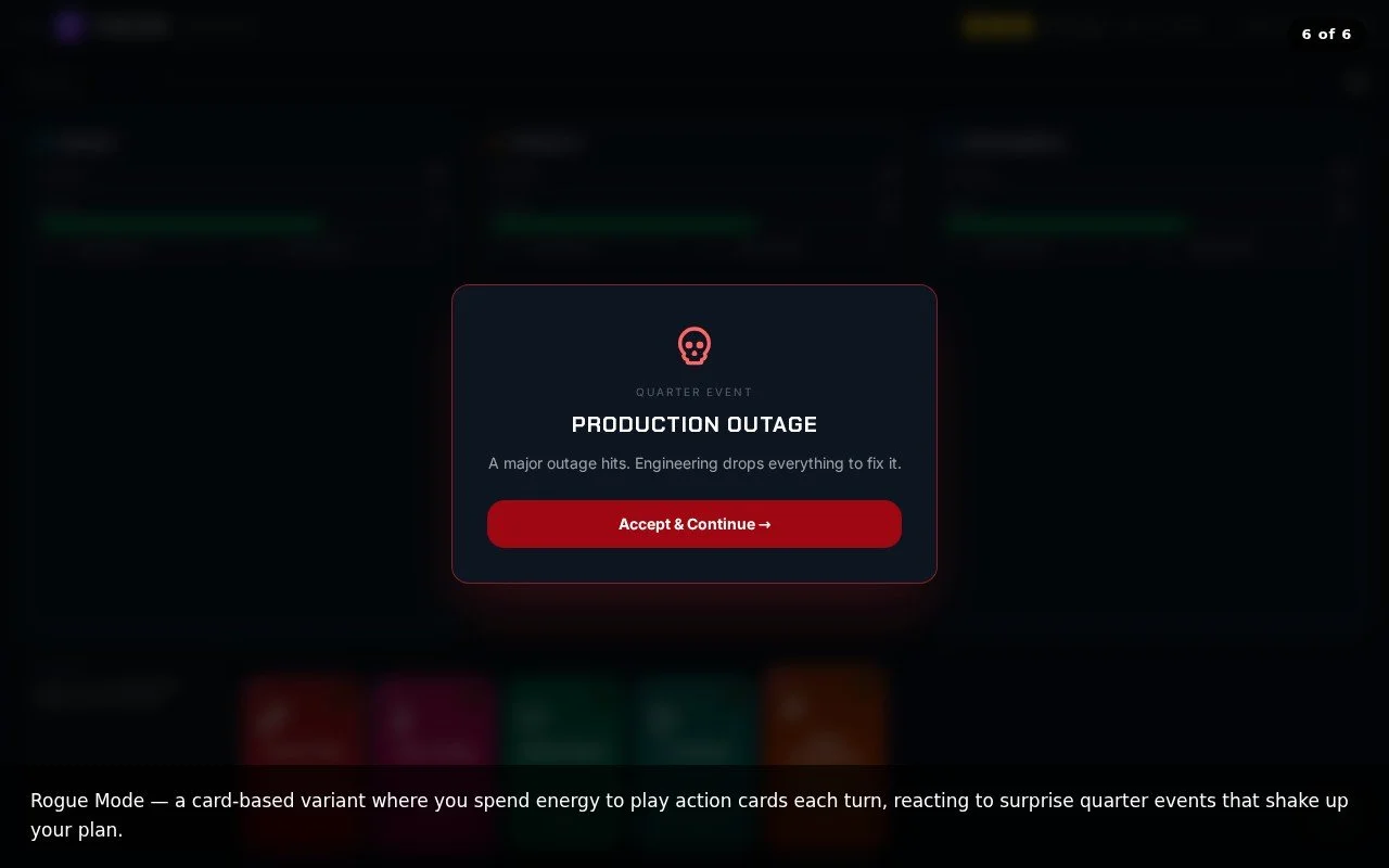
Team Sim (which will be renamed at some point) is a turn-based game based roughly on the overall software development lifecycle. You play as the division leader and manage team morale and velocity. It is intentionally satirical and I hope it will make people smile and maybe even spark some ideas when I release it (Summer 2026).
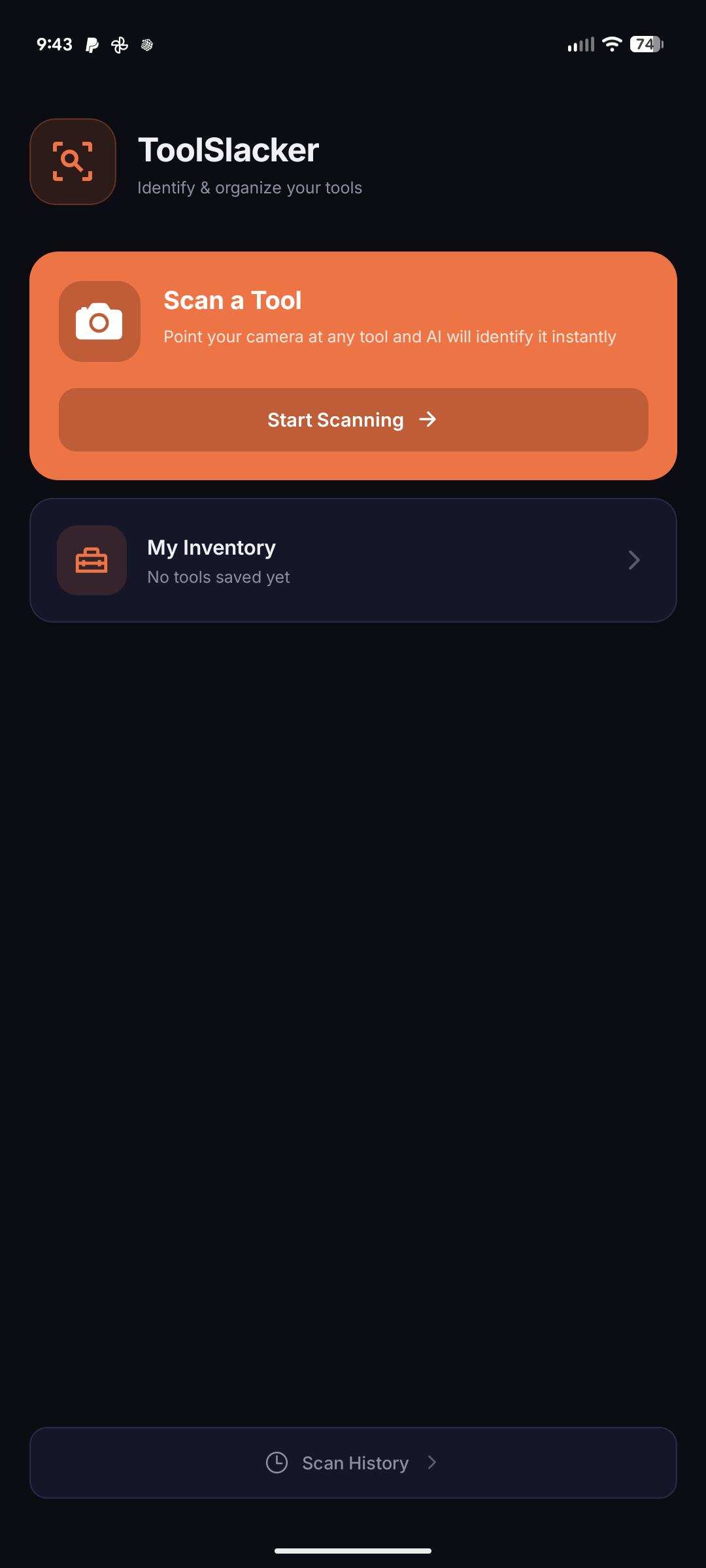
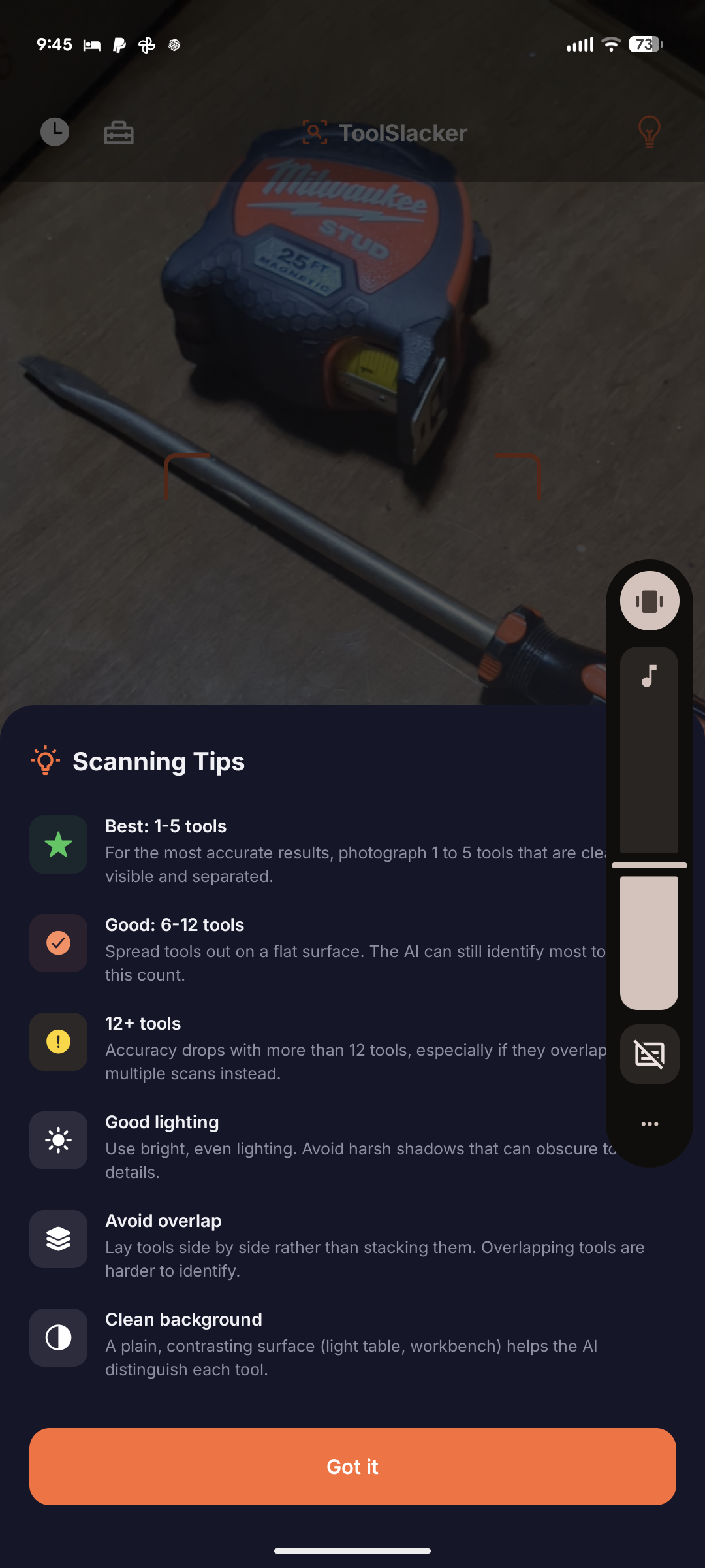
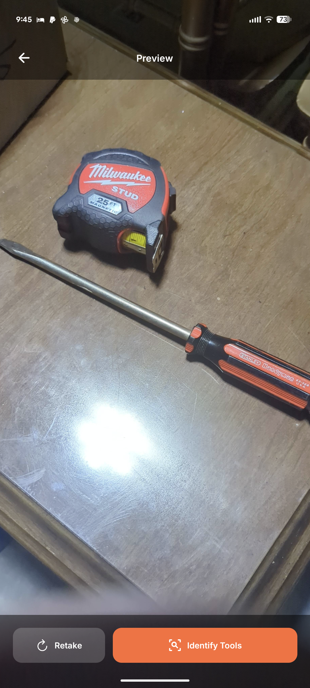
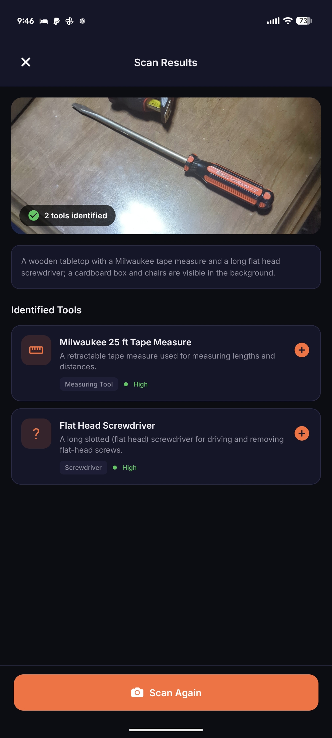
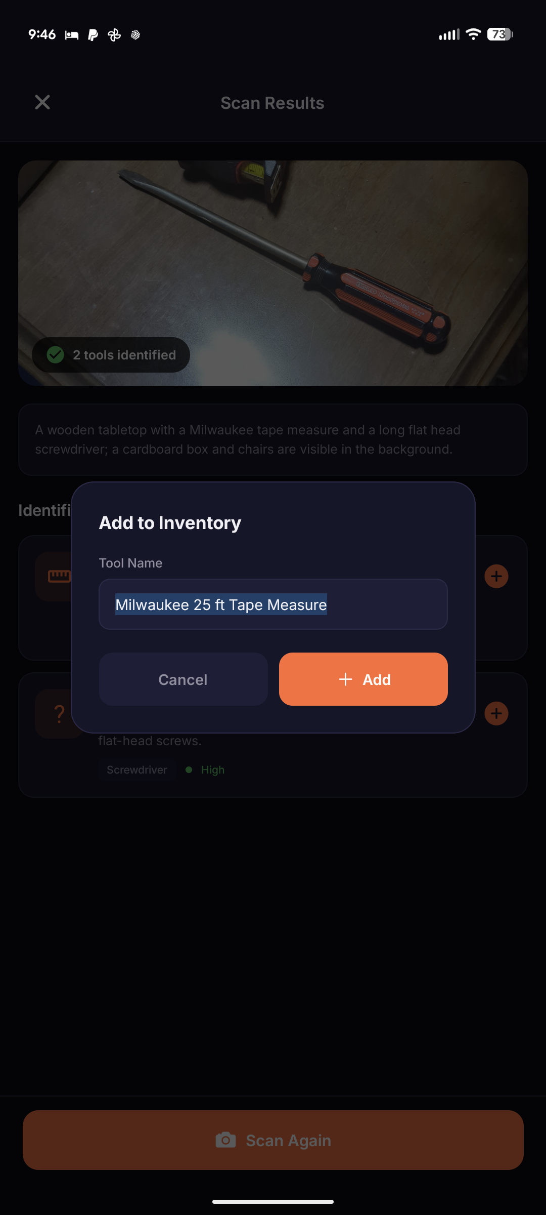
Tool ID began out of my own need to organize my garage. Take photos of tools, have them identified, then add them to “virtual toolboxes” which can be used just as an inventory or as a representation of how you [want to] physically keep your tools.